In a previous post, I said that I wouldn't unpack the specific details of the art choices that went into Paper Birds.
It has been on my mind a bit since then, so I'm giving it a bit of a treatment today.
This was for the Emotional Mecha Jam, so I wanted the art to be both martial and sad. This was also heavily influenced (as previously mentioned) by the 1965 Nuclear War board game, so some of that Strangelove style dark satire worked its way in, too.
I knew immediately that I was making a game about autonomous drone swarms, and because it was the #SadMechJam they had to be fragile, disposable, and forlorn.
Senbazuru seemed like a fitting choice, not just for the ephemeral fragility of the paper, but because the legend its self fit very closely with the game's themes. 1000 paper cranes are folded to hope for a wish to be fulfilled by the gods, and are left to deteriorate in the elements. Often the wish is for healing, but it can also be for victory. The cranes themselves are icons of peace and, in my experience, few things are more martial than a wish for peace.
I didn't want to directly state anything specific about the actual mythology of folding one thousand cranes, so I simplified it to a title that I hope invoked something fragile and ephemeral — meaning both the drones and the memories of the pilot.
In this case, the suggestion is that the pilot is making a wish — and encoding their engrams — upon the drone swarm as it is launched. The player then takes the role of the swarm as they attempt to fulfil the pilot's wishes.

The cover art is a public domain photo taken by USMC Sgt. Brittney Vella. I liked the notion that it was martial in origin and also captured the content that I wanted to be illustrated. And it was free.
It also helped that it blended well onto a black background for the cover, because I'm not very good at photo manipulation, and many of the other pieces of art I was considering had noisy backgrounds that I couldn't easily extract.

The backs of the Decision Cards had a functional purpose: obscuring the text on the face side, when the card is placed face-down. This way the two-sided card would not be readable if it was printed on thin paper from a home printer.

This fill pattern was intended to evoke a sense of Dazzle Camouflage. Something nearly but not-quite modern, plausibly futuristic, and abstractly artistic. Something to subtly disguise the nature of the origami pattern, as well as to disguise the face-text of the card. Something martial.
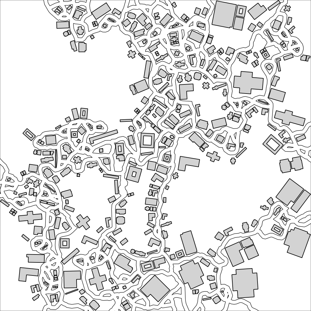
For the objective cards, I really wanted to use procedurally generated art from @metropologeny but I couldn't locate any copyrights. The goal was simple nearly-abstract line art that would print easily and fade into the background of the card. It didn't really have a function in play, but it needed some art and I wanted that art to suggest things that you might not feel great about blowing up.
Things that might be targets, or things that might have the misfortune of being near a target. Things that people probably live in, and that most people would avoid using as a warzone if they could really help it.

I was really fixated on the @metropologeny stuff, and eventually ended up with a 19th century ordnance survey map from what is now Crouch End. The tiny zoomed-in slice I took didn't really deserve an image credit, but I put one there anyway just to make it abundantly clear that your drones were going to cause some collateral damage if you decided to pull the trigger. In this version of Tottenham Lane, you probably don't want to be holding real estate.

I laid out the document headers with white lettering on blocks of black text, to hint back to the high contrast "dazzle" pattern on the decision cards. I thought it also tied in as a negative inversion of the cover, and did a nice job of letting me define a variable column layout without putting any other dividers or boxes on the page.
The font its self I didn't credit, but probably should have. Noto Sans is possibly, at this particular moment, one of the most ubiquitous fonts on the web. OFL, developed by Google, etc. Possibly a soulless choice in the view of many font aficionados, but also possibly appropriate for an autonomous swarm of killing machines.
I knew that I needed a sans-serif font, something humanist. Something with a similar philosophical profile to Helvetica. I really did a lot of scouring and asking people with superior aesthetic taste to my own. Despite their better advice, this is where I ended up. I like its relaxed and readable kerning, slightly modulated strokes, and really everything about it.
Unfortunately, it probably makes people feel like they are reading their gmail. C'est la vie.
I would like to think that all of these elements tie together into a cohesive whole and create a specific feeling for how the reader experiences Paper Birds.
Looking back on it, however, I have my doubts.
No comments:
Post a Comment